通俗的来说就是左右两栏固定宽度,中间部分自适应的三栏布局。
margin 负边距
在讲圣杯布局和双飞翼布局之前,我们需要插入一个知识点,那就是 margin 负边距。
先写一段 html 代码。
1
2
3
4
5
6
7
8
9
10
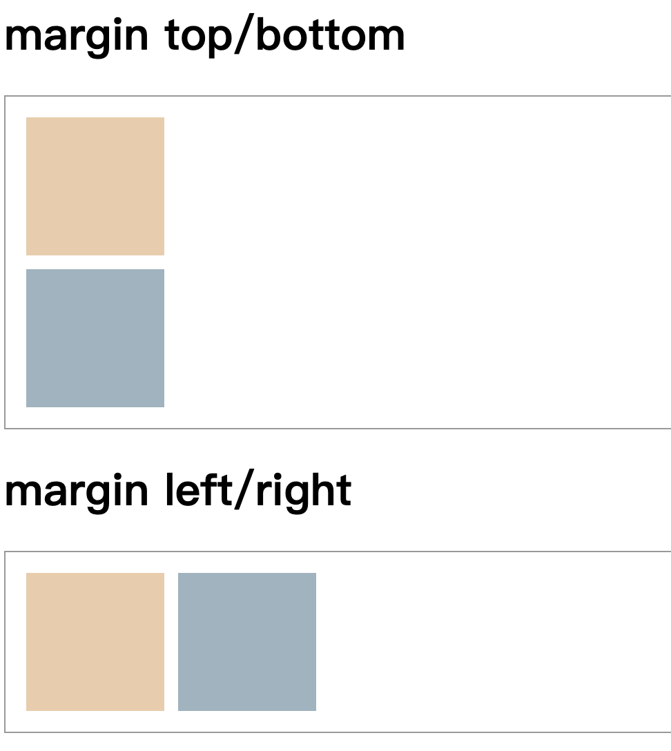
| <h1>margin top/bottom</h1>
<div class="flex flexcolumn">
<div class="box firstBox"></div>
<div class="box secondBox"></div>
</div>
<h1>margin left/right</h1>
<div class="flex">
<div class="box firstBox"></div>
<div class="box secondBox"></div>
</div>
|
1
2
3
4
5
6
7
8
9
10
11
12
13
14
15
16
17
18
19
| .flex {
display: flex;
border: 1px solid #999;
padding: 10px;
}
.flexcolumn {
flex-direction: column;
}
.box {
width: 100px;
height: 100px;
margin: 5px;
}
.firstBox {
background-color: #eccdaa;
}
.secondBox {
background-color: #9bb4bf;
}
|
![image-20220114160450447]()
接下来就到我们的正题了。
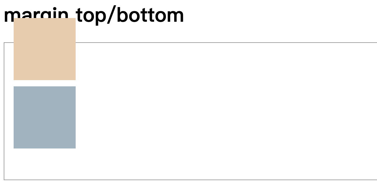
top/bottom
先说结论,在看结果。
margin-top 负值 元素向上拖拽。
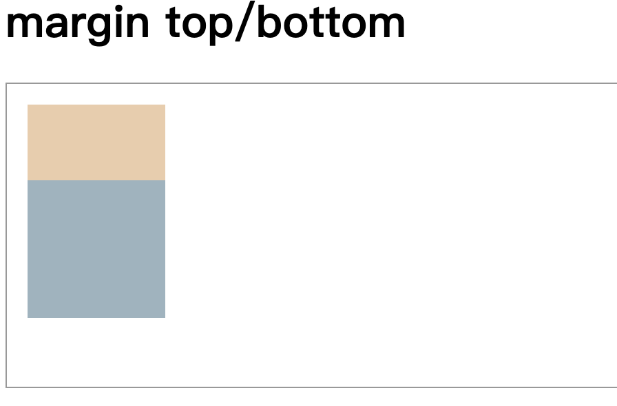
margin-botton 负值 元素本身不变,下边元素上移。
我们先来看看 margin-top
1
2
3
| .firstBox {
margin-top: -50px;
}
|
![image-20220114161111959]()
整体向上拖拽了。
接下来我们看看 margin-bottom
1
2
3
| .firstBox {
margin-bottom: -50px;
}
|
![image-20220114161329647]()
这时候,我们就可以看到,firstBox 本身不变,而 secondBox 向上移动。
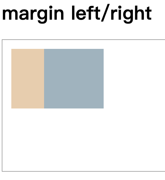
left/right
先说结论,在看结果。
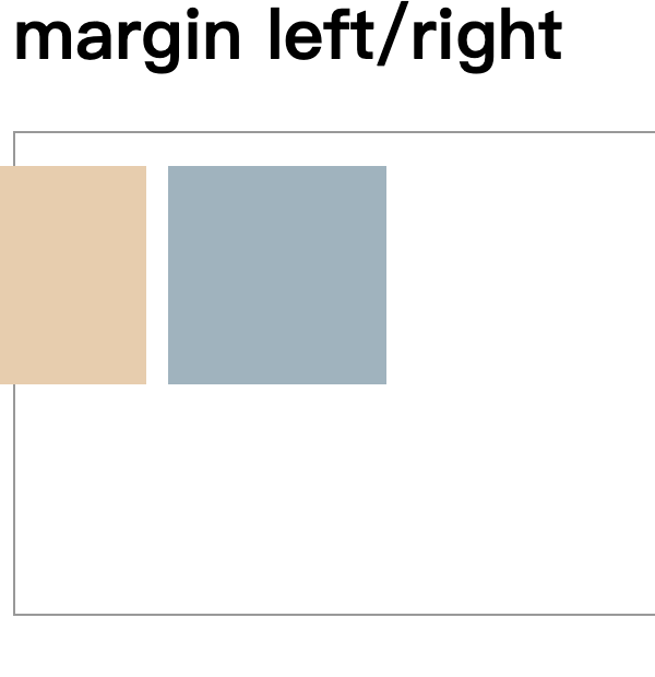
margin-left 负值 元素向左拖拽。
margin-right 负值 元素本身不变,右边元素左移。
我们来看看 margin-left
1
2
3
| .firstBox {
margin-left: -50px;
}
|
![image-20220114161641065]()
元素向左侧拖拽。
1
2
3
| .firstBox {
margin-right: -50px;
}
|
![image-20220114161713049]()
元素本身不变,右边元素左移。
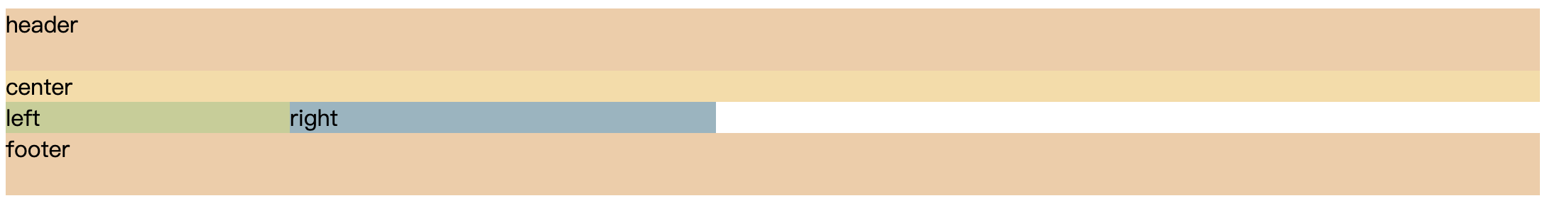
圣杯布局
接下来就是正题了,我们先从圣杯布局开始。
目的
- 两侧内容宽度固定,中间内容宽度自适应
- 三栏布局,中间一栏最先加载、渲染出来(主要内容)
实现方法
使用 float + margin
我们先写一个大概布局
1
2
3
4
5
6
7
8
9
| <div>
<div class="header">header</div>
<div class="wrapper clearfix">
<div class="center">center</div>
<div class="left">left</div>
<div class="right">right</div>
</div>
<div class="footer">footer</div>
</div>
|
1
2
3
4
5
6
7
8
9
10
11
12
13
14
15
16
17
18
19
20
21
22
| .header,
.footer {
background-color: #f2cda5;
height: 44px;
}
.left,
.right,
.center {
float: left;
}
.center {
background-color: #f8dca3;
width: 100%;
}
.left {
background-color: #c6ce93;
width: 200px;
}
.right {
background-color: #95b5c0;
width: 300px;
}
|
现在我们展示的样子是什么样的呢?
![图1.第一布局图]()
接下来,我们给来清除一下浮动
1
2
3
4
5
| .clearfix::after {
content: '';
display: block;
clear: both;
}
|
![image-20220114141712822]()
现在我们看到的结果,就有点像样的。
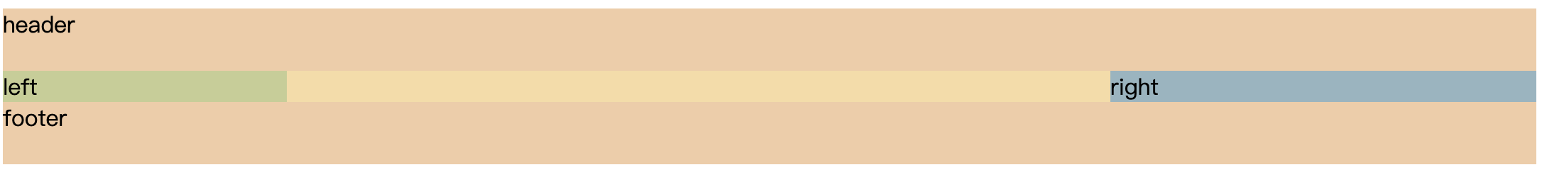
这里我们要知道,为什么 left 会在下面呢?是因为宽度不够,然后导致 left 和 right 被挤压下来,所以在这里可以使用 margin 负边距。
但是我们要做的是什么呢?让 left 在前,right 在中,center 自适应。
然后我们使用 margin 负边距,对左右进行设置 margin-left。
1
2
3
4
5
6
7
| .left {
margin-left: -100%;
}
.right {
margin-left: -300px;
}
|
这时候,我们看到的就是这样的。
![image-20220114152116579]()
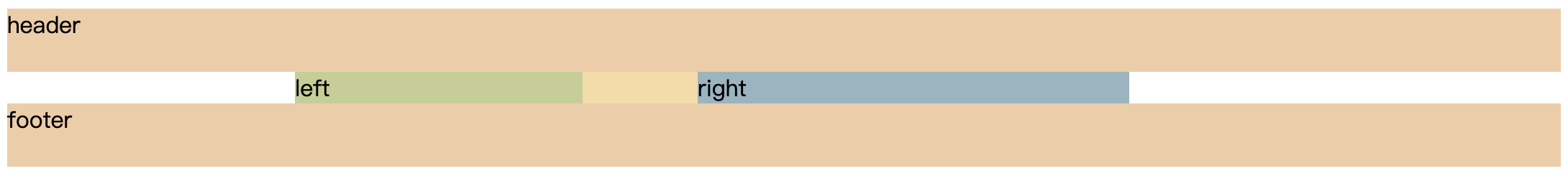
我们发现,center 被遮挡了,我们给外部添加 wrapper,给 left 和 right 预留出空间。
1
2
3
| .wrapper {
padding: 0px 300px 0px 200px;
}
|
![image-20220114152321369]()
这时候,我们看到的结果是,预留了空间,但是接下来呢?怎么将 left 跟right 分别移动到预留的空间里呢?
其实很简单,我们使用《相对布局》就可以完成。
1
2
3
4
5
6
7
8
| .left {
position: relative;
left: -200px;
}
.right {
position: relative;
right: -300px;
}
|
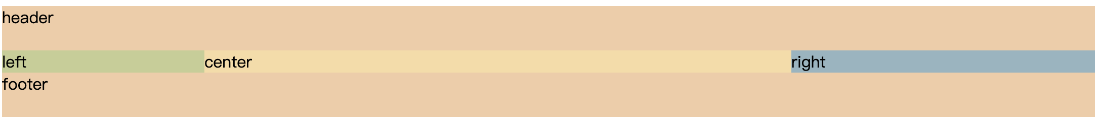
![image-20220114153129007]()
来看看全部的 css 吧。
1
2
3
4
5
6
7
8
9
10
11
12
13
14
15
16
17
18
19
20
21
22
23
24
25
26
27
28
29
30
31
32
33
34
35
36
| .header,
.footer {
background-color: #f2cda5;
height: 44px;
}
.wrapper {
padding: 0px 300px 0px 200px;
}
.left,
.right,
.center {
float: left;
}
.center {
background-color: #f8dca3;
width: 100%;
}
.left {
background-color: #c6ce93;
width: 200px;
margin-left: -100%;
position: relative;
left: -200px;
}
.right {
background-color: #95b5c0;
width: 300px;
margin-left: -300px;
position: relative;
right: -300px;
}
.clearfix::after {
  content: '';
  display: block;
  clear: both;
}
|
双飞翼布局
目的
- 两侧内容宽度固定,中间内容宽度自适应
- 三栏布局,中间一栏最先加载、渲染出来(主要内容)
实现
使用 float + margin
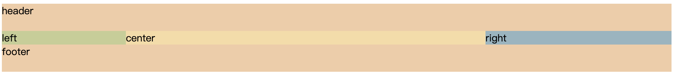
双飞翼布局和圣杯布局很类似,不过是在 wrapper 的内部又插入一个 div,通过调整内部 div 的 margin 值,实现中间栏自适应,内容写到内部 div 中。
因为两个比较相似,所以我们直接上代码。
1
2
3
4
5
6
7
8
9
| <div>
<div class="header">header</div>
<div class="wrapper">
<div class="center">center</div>
</div>
<div class="left">left</div>
<div class="right">right</div>
<div class="footer">footer</div>
</div>
|
在来看看 css 实现。
1
2
3
4
5
6
7
8
9
10
11
12
13
14
15
16
17
18
19
20
21
22
23
24
25
26
27
28
29
30
31
32
33
34
35
36
| .header,
.footer {
background-color: #f2cda5;
height: 44px;
}
.wrapper {
  padding: 0px 300px 0px 200px;
}
.left,
.right {
float: left;
}
.wrapper {
float: left;
width: 100%;
}
.center {
background-color: #f8dca3;
margin: 0px 300px 0px 200px;
}
.left {
background-color: #c6ce93;
width: 200px;
margin-left: -100%;
}
.right {
background-color: #95b5c0;
width: 300px;
margin-left: -300px;
}
.footer {
clear: both;
}
|
效果与圣杯一样。
![image-20220114155411899]()