CSS 系列之position 定位
position 就是定位。让我们可以对部分布局当中一些元素的位置进行调整。定位其实就是一个工具,让我们的页面看起来更加舒适。
在 CSS 中,我们使用 position 属性的不同值来设置。
静态定位(static)
静态定位是每一个元素的默认值,在将元素放入正常位置。
使用 position: static 来设置静态定位,但是 static 作为一个默认值,你也可以不设置。
1 | .box { |
1 | <body> |

我们发现第二个元素与其他元素并没有区别,所以静态定位是作为元素的默认值使用的,一般不用设置。
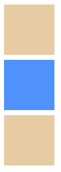
相对定位(relative)
相对定位与静态定位非常相似,占据在正常的文档流中,但是你可以修改它的最终位置,也可以让它与页面上的其他元素重叠。
如果我们仅仅只是设置 position: relative,其实你就会发现与静态定位效果是一样的,所以这时候我们就需要对元素的位置进行移动了。
1 | .box { |
其实从代码中就可以看出,通过 top , bottom , left , right 来精确指定元素的位置。
其实设置相对定位,是相对于自己在正常文档流中的位置来进行定位。并不是相对于 body 进行定位,所以会产生上面的结果。
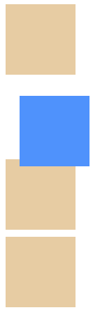
绝对定位(absolute)
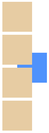
绝对定位就会有不同的地方了。通过 position: absolute 来设置绝对定位。
- 不存在于正常文档流
我们来看看设置之后的效果。
1 | .absolute { |
从上图,可能就在想,为什么设置了绝对定位后,少了一个格子呢? 其实就是设置了 position: absolute 的 div 脱离了正常文档流,导致第三个 div 被遮挡了。
top,bottom,left,right在绝对定位中是与relative中不同的。他们是相对于自身的定位元素的边进行定位的
我们在静态定位中的 html 代码中,都是相对于定位元素来设置的。
1 | .absolute { |
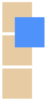
定位上下文
对绝对定位中的定位元素有异议?其实包含元素取决于绝对定位元素的父元素的 position 属性,如果祖先元素中有 absolute/relative/fixed 时,就是根据找到的祖先元素来进行定位。
如果所有的父元素都没有显式地定义 position 属性,那么都被默认设置为 static。这时候,绝对定位元素会被包含在初始块容器中。而初始容器块其实就是有着与浏览器视口一样的尺寸,并且 <html> 也被包含在这里面。简单来说,absolute 会被放在 <html> 元素外,并根据浏览器视口来定位。
所以在介绍绝对定位时的代码,虽然被放在 <body>中,但是最终的布局中,是相对于页面来布局的,并不是 <body>。
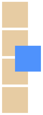
我们来看看在第二个 div 中使用 position: relative,来改变定位上下文。
还是老例子,修改代码,对第二个 div 进行嵌套看效果。
1 | .relative { |
1 | <div class="box"></div> |
这时候,我们就会发现,absolute 是相对于定位元素的 relative 所布局了。
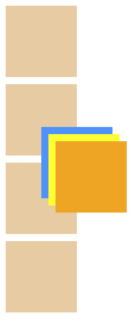
z-index
在这里呢,我们也要介绍一个属性,z-index。
默认情况下,元素的 z-index 值为 auto,实际上为 0,当然要注意,它只接受无单位索引值。
其实简单来说就是页面的重叠,值越大,就在高层,越容易出现在页面中。
我们直接在上面的代码中添加 z-index: -1,方格就会显示在下面。
1 | .absolute { |
我们在来修改一下代码。
1 | .absolute { |
1 | <div class="box"></div> |
刚刚我们说了,z-index 越大,显示在越上层,所以结果就应该属性为 z-index: 2 显示在最上层,其次是 z-index: 1,最底层为 z-index: 0。
固定定位(fixed)
固定定位(fixed)其实与绝对定位类似,只不过 fixed 都是相对于浏览器视口来定位。
为了看到效果,增加了盒子的高度,其实效果就是固定在页面中的某一个部位,相对于浏览器窗口来定位。
不会因为你的滚动而改变。
1 | .box { |
1 | <h2 class="fixed">固定标题</h2> |
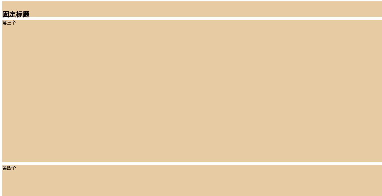
如上图所示,为已经滚动到第三个 div 左右的位置了,标题还是在浏览器的这个位置,没有任何变化。
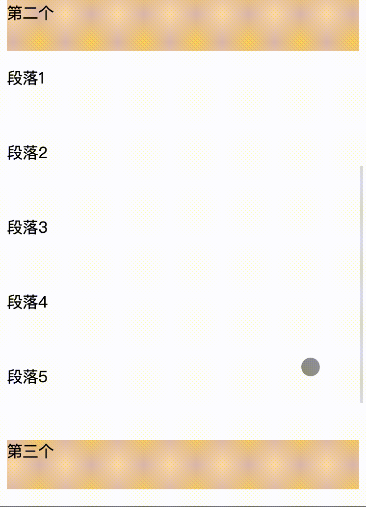
position: sticky
是一个有趣的东西,让每一个的标题固定,看完效果后,肯定就明白了。
1 | .box { |
1 | <div class="box">第一个</div> |
定位基本上就介绍到这里了,具体的使用还需要多去操作,上手才可以。